Editorial intelligence for video creatorsLearn more →
Do typographylike the top 1%
Everyone has the same fonts.
Not everyone has the same instinct.
Not everyone has the same instinct.
Varnam is an editorial intelligence layer for creators and designers. It analyzes story, tone, emotion, and intent. Then it recommends typography based on fit & trends.
Varnam is an editorial intelligence layer for creators and designers that reads your story's tone, emotion, intent and matches it to the right typography.
1–2 hrs
saved per project on average
10x
faster typography decisions
High
Loved by creators, designers & editors.
Typography shapes perception before it comprehends
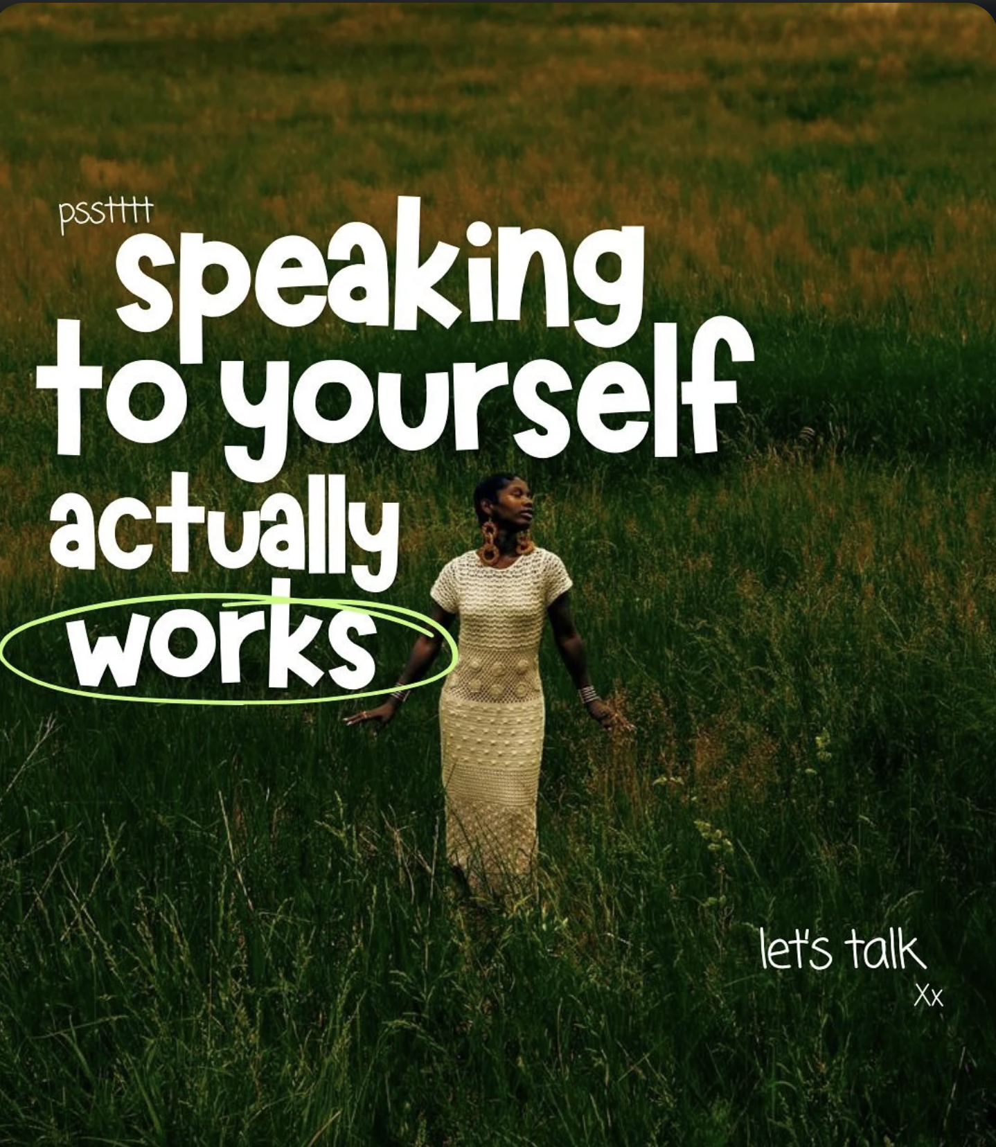
psstttt
speaking
to yourself
actually
works
let's talk
xx
psstttt
speaking
to yourself
actually
works
let's talk
xx
psstttt
speaking
to yourself
actually
works
let's talk
xx
psstttt
speaking
to yourself
actually
works
let's talk
xx
Same words. A different feeling in every typeface.
Your audience decides how your content feels before they read a single word.
Not because of what you said.
Because of how it looked when you said it.
Your audience feel it before they read it.
Not what you said.
How it looked when you said it.
Stop blending in
Start standing out
Varnam reads the personality underneath your work - and finds typography that's intentional, not automatic.
Context
Reads the story and intent behind the frame.
Personality
Matches type to your voice and tone.
Right fit
Gives you one confident, ready-to-use choice.
Most tools give you options.
Varnam gives you the one that fits.
The hard part was never the fonts. It was choosing without real knowledge. Varnam nailed the first recommendation for 0% of beta users.
Without Varnam
With Varnam
Picks a font blindly
Reads your content first
All fonts
The one font that's right
No context, no reasoning
Full context, real reasoning
Generic look
A look that's yours
Typography made intuitive.
No fonts to compare, no rules to learn.Just the right fit, instantly.
01
Upload your video
Drop in a reel, ad, or clip.
02
Varnam analyses
Emotion, tone, pace - like a top 1% editor would.
03
Get the right type
See the pick, see the why. Apply and ship.
FAQ
It actually watches your video. It looks at the tone, what you're saying, and who it's for. Then it figures out what kind of typography fits that. It's not picking random fonts from a list.
Not at all. Varnam just shows you a few directions that fit. You still choose the one you like, tweak it however you want, and ship it. It helps you decide; it doesn't decide for you.
Most editing tools hand you a font library and let you figure it out. Varnam does the opposite. It looks at your actual content first, then shows you what fits, so you're not staring at a dropdown trying to guess.
Setting up your brand takes about a minute or two. After that, each direction comes back in roughly 60–90 seconds.
You do. Everything Varnam suggests is fully yours to use, including for commercial work. We don't claim any ownership over what comes out of it.
Just email us at contactvarnam.ai@gmail.com. We usually get back within 24 hours on business days.
Your content has been asking for something specific.
It's time to find out what.